Amazon.com
UX DELIVERS COMMUNITY GROWTH
Increased user activation and engagement on publishing-focused site for authors by advocating for user experience needs.
PROJECT OUTPUT
Design Tenets, Wireframes, Design Comps, User Flows, Prototypes, User Research Plans & Analysis, Design Specifications
COLLABORATED WITH
Product Management, Community Strategy, Engineering, Visual Design, Design Direction, VP and SVP of Kindle Content Ecosystem
MY ROLE
Led cross-team efforts to enhance product and grow community by driving design objectives and research plan. I aligned vision and product strategy across multiple teams, clarified customer needs, delivered designs, and guided design implementation.
THE STORY
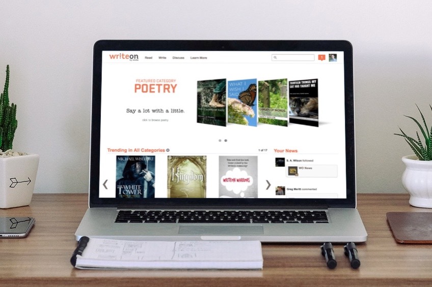
Write On needed to grow its community to thrive and ultimately produce valuable content for the Amazon Kindle bookstore. I joined the team when the site had basic functionality that enable authors to share their works-in-progress, connect with early readers, and get feedback. But, it lacked levers to drive engagement and growth and had a visual appearance that some described as "DIY". I took on the role of identifying how UX could improve the Write On community with the intent to drive growth and engagement. I also led and oversaw a complete visual refresh that elevated the site's professionalism.
The Customer Problem
Many writers rush to publish their works independently and find that they get little response in the market, or worse, receive reviews criticizing the quality of their writing. Some writers aspire to sign with a publishing house and believe they just need a way to prove their work and connect with readers prior to hiring an agent.
The Write On Community was Amazon’s way of solving this customer problem. However, they found that they were just merely missing the mark showing low engagement, lack of growth and a lackluster visual appearance.
The Process & Solution
I led the Product Manager, Community Manager, and Engineers in Design Thinking methods by planning, conducting, and analyzing user interviews. I synthesized designs and practiced rapid iteration in order to get to a design that truly connected the writers to the community and enable story discovery. I also led a brand and visual design refresh by engaging and guiding Visual Designers in an internal consulting group on this work. I guided the vision and maintained alignment with stakeholders across Kindle Content and up to the VP level as I upheld a high-bar overseeing the implementation of this redesign.
One of the most vital parts of this experience was a commenting interaction that let authors get feedback while workshopping their stories. At one point, leadership asked for a redesign of this functionality, and directed that this should behave like the inline comments that were available at the time on Medium.com. By rapidly prototyping, running user testing and user interviews, and especially by inviting all stakeholders including the engineers, we discovered together that this behavior did not match the customers needs. This version, which was nearly a copy of our competitor, was estimated at 6 months of engineering effort.
The Result
By iterating and collaborating with both the engineers and product owners on inline commenting, I was able to recommend a simpler solution which truly delighted our writers and cut engineering time to only one month. Before this update was launched, Medium announced that they were abandoning the inline commenting behavior that originally sparked this effort.
Iteration of top funnel experiences drove me to design the Feature Banner, which instrumentation data and customer surveys showed was the primary driver of customer activation and engagement. To address the learning that some writers felt their work was going “into a void” I conceptualized, pitched, and delivered the design for Story Shuffle, which enabled serendipitous story discovery and drove activation and engagement of lesser known writers on the site.
As a result, users were able to get meaningful feedback on their work. Some of the writers self-published their works while a few even signed with Amazon Publishing through the Kindle Scout program.
And, the visual refresh was a big hit with the community. One of my colleagues said we’d “removed the dinge” from the site and one customer commented that it felt like we’d “turned the lights on”.
Summary
With my design leadership, we invented and built in levers that enabled the community to grow and achieve their goals to improve their writing and develop quality content for the Amazon Kindle bookstore.
I also enabled the team to dig deeper and uncover the customers' true needs, which averted a costly error regarding the roadmap for inline commenting, the site's most core functionality.

